Creating a new digital donation platform for Ducks Unlimited Canada
Organization
Ducks Unlimited Canada
Role
Project Lead, Product Designer, Frontend Developer
Date
2017 – 2018
Ducks Unlimited Canada (DUC), a nonprofit environmental conservation organization, conserves wetlands and other natural spaces for waterfowl, wildlife, and people. For more than eighty years, the organization has been protecting and managing habitats across Canada that affect the lives of millions of Canadians every day.
As part of the organization’s ongoing renewal of its digital ecosystem, I initiated a project to revitalize the user experience of making online donations to Ducks Unlimited Canada. Our goal: increase supporter engagement and donor activity while streamlining the donation process with a new, sustainable digital platform.
This project supported DUC's recently completed Rescue Our Wetlands fundraising campaign, which conserved more than 650,000 acres of wetlands and native habitats across Canada while influencing another 96 million acres of habitats from coast to coast.
As the UX lead on this project, I lead the organization through a human-centred process of research and discovery, strategy, business alignment, user interface and interaction design, usability testing, and development. The result: a usable, effective, and sustainable donation experience for Ducks Unlimited Canada.
Challenges
- How might we identify and prioritize both business and user goals around the donation experience?
- How might we build a shared organizational understanding of the user’s journey through the donation experience?
- How might we create and validate an effective, streamlined donation flow that implements the right features at the right time?
Research & Discovery
To gain a better understanding of DUC’s business goals and constraints along with user needs and behaviours, I kicked off a discovery phase based on a range of quantitative and qualitative research methodologies.
I held a series of stakeholder interviews across several business lines to better understand DUC’s business goals, requirements, and constraints. Each of these interviews was captured in audio and text format, and was used to identify common themes and specific needs.
I also explored existing data and artifacts, including:
- donor activity
- traffic and user analytics data
- audience demographics and targeting data
- customer service interactions
Along the way, I captured insights in a central location accessible to the whole project team.
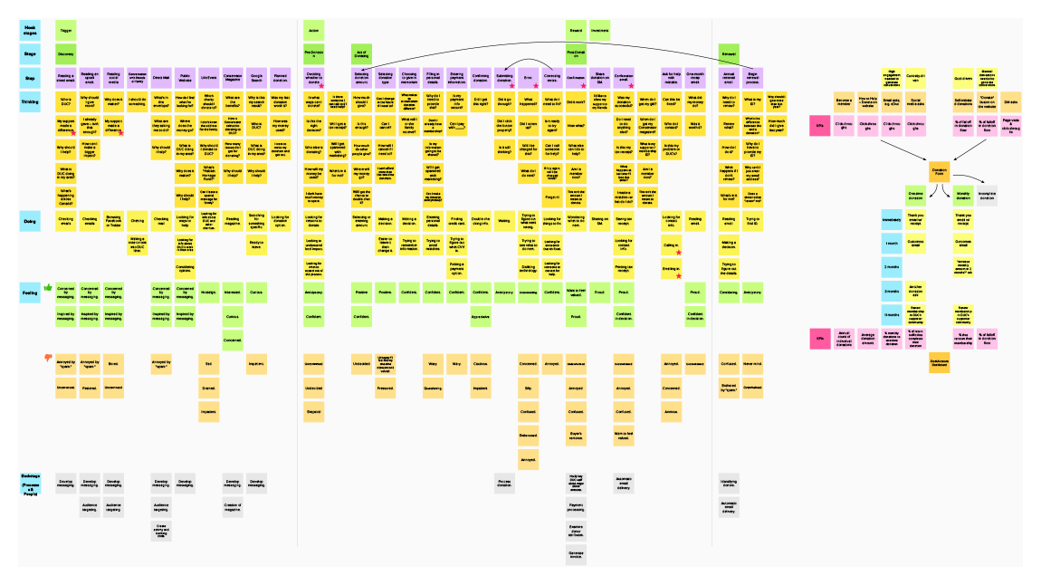
Journey Mapping Workshop
I held a journey mapping workshop with a range of business lines to get a better understanding of the front- and back-stage activities involved in the donation experience.
This workshop not only helped me and the others on the project team better understand the nitty-gritty details of online donations to DUC, it helped other business lines visualize and empathize with users while identifying opportunities for improvement.
Based on the journey mapping workshop, I created a digital experience map that I shared with the team.
Strategy
We needed to build a product mindset around the donation experience. This would let us make decisions based on real insights and to continuously measure, evaluate, and iterate on the platform over time.
Based on the insights collected through research and discovery, I held a series of workshops with the project team to turn insights into action.
Prioritizing with 2x2 Matrixes
One of the workshops resulted in a 2x2 matrix to help the project team prioritize features and functionality. This helped the project team decide what to do now, and what to tackle in the future.

Based on our digital supporter engagement strategy, we knew our users fell into one of four user segments on the path from converting from a visitor to a supporter:
Visitor → Prospect → Supporter → Loyal Supporter
Guided by our findings, I defined clear measures of success for the project through generalized and channel-specific KPIs.
User Flow Diagramming
Based on findings from the research phase, I created a series of user flow diagrams that visualized the variety of paths that a user can take through the donation flow, and how a donation flow may be customized for an individual user.
For example, users may enter the flow through:
- Direct mail campaigns
- Calls to Action tied to specific stories or content on the public outreach website
- Google Adwords campaigns
- Television advertising
- Social media asks
- Renewal mailings
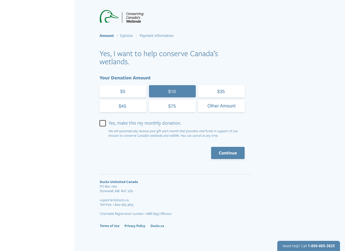
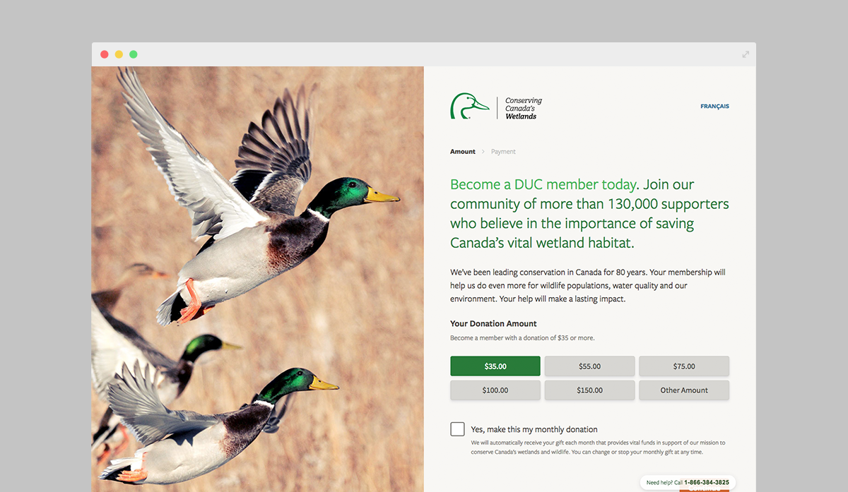
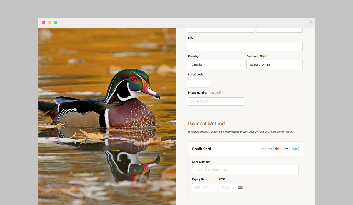
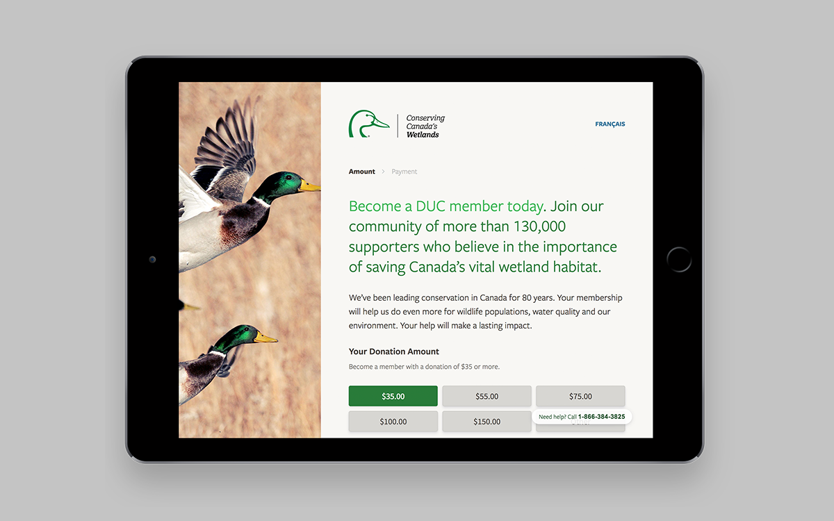
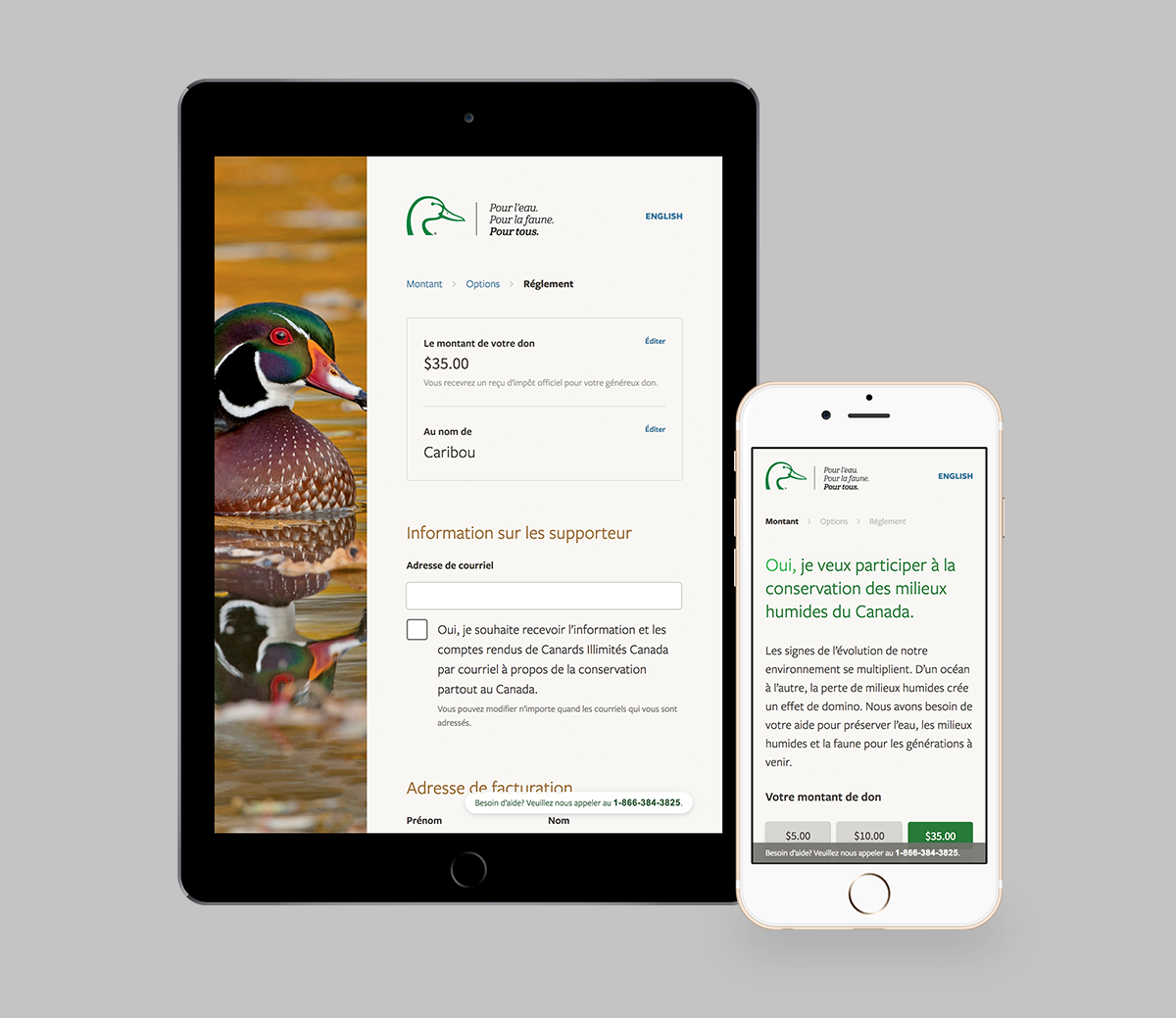
Based on these user flow diagrams, I defined the concept of “donation flows,” which may contain any number of “steps,” usually starting with a donation amount and ending with a confirmation.
This approach would let DUC insert new “steps” to collect information like supporter ID numbers and unique direct mail codes, and use that information to tailor what donation amounts are displayed to the user.
With buy-in from all stakeholders, we were ready to move into rapid wireframing, prototyping, and iteration.
Prototyping & Design
Rapid wireframing and prototyping with Adobe Xd, Invision, and React helped the project team explore several directions before identifying a promising design approach.
Usability Testing
Before moving into high-fidelity design and development, I performed usability testing on the proposed direction for the donation experience to validate design and content and decisions, identify challenges, and iterate based on real user feedback.
I recruited a range of study participants that closely matched our defined user personas, and designed a usability study that would examine several different donation flows.
The usability study was captured for viewing by the whole project team. The team identified specific challenges in early test sessions, and rapid iteration on the interface design allowed us to test solutions right away.
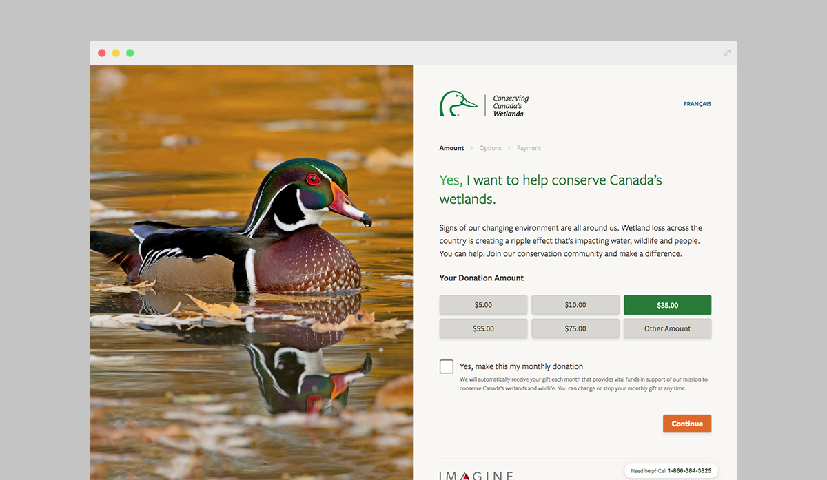
Design Outcomes
Guided by the findings of the usability testing, the project team and greater organization was confident in the design direction, and identified specific opportunities to improve on the chosen design direction and the overall donation experience.
Thanks to our existing UI design system, progressing from wireframes to high-fidelity UI design was a snap.
The final design is accessible and adapts seamlessly to several distinct user flows, with incredibly fast performance on both desktop and mobile devices.
Results
The newly-launched donation experience had an immediate impact on Ducks Unlimited Canada’s online donor activities.
118%
more donations
153%
increase in donation revenue
14%
increase in average donation amount
Data reflects year-over-year activity for a defined period of time as of December 2017.
The transformational effect of human-centred design
The donation experience project had a transformational effect within the greater organization. In response to challenges and insights uncovered during user experience research and strategy, the organization rolled out significant changes to its business processes and activities, its approach to supporter outreach, conversion, and retention, and implemented a new membership model for supporters.
—
Technical details
I built the new donation experience with React + Redux, SASS, and Webpack on the frontend, and NodeJS + Express on the backend. Stripe handles one-time and monthly transactions, while SendGrid delivers transactional emails.