Measuring taste to bring better recipe recommendations to a global community of home cooks
Organization
Marley Spoon
Role
UX Lead
Date
2019
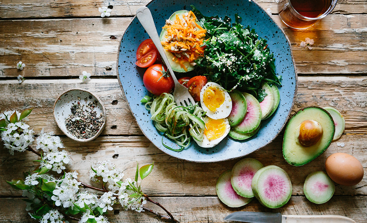
Planning healthy, fresh, and easy meals should be a delight, not a chore. That’s why Marley Spoon gives people the choice of more than 20 recipes from a changing weekly menu, and delivers all of the ingredients and recipes they need directly to their door.
Marley Spoon is a multinational meal kit company that has delivered more than 27 million meals to customers in three continents and eight countries around the world over the past five years.
When the company wanted to leverage machine learning to expand beyond its existing 20-recipe menu with the help of personalized taste preferences, I lead research, UX strategy, and design for Marley Spoon’s “Taste Profile” project—the first step in unlocking the perfect menu.
The Challenge
When Marley Spoon launched in 2014, they only offered six recipes in each weekly menu. In 2018, the company expanded its menu to give customers their choice of twenty unique recipes each week.
While the 20-recipe menu was well-received by customers, Marley Spoon knew that most customers don’t truly have 20 choices due to their own personal preferences and needs. But, expanding beyond the already-large menu adds to an already intensive 12-week process of designing and testing recipes for each weekly menu.
The company was already heavily data-informed, using customer feedback to iterate on original recipes and overall menus to meet a wide range of dietary preferences and needs. That’s why Marley Spoon saw the opportunity to bring machine learning into its operations. It was an intuitive next step to put this data into action first to recommend the recipes that each customer would be most likely to enjoy, and then ultimately, generate dynamic, personalized weekly menus for each customer.
Our product vision set our goal: the first stage of the broader project would involve building a better understanding of our newest customer’s taste preferences, and using this to recommend recipes from our existing weekly menu that best matched their preferences.
Then, we would build on this initial understanding of their preferences based on what recipes they ultimately chose to cook, and the ratings and reviews they provided after cooking each meal, to keep providing better recommendations.
In the long term, we’d be able to predict which recipes would be most popular, and how we could build the perfect menu for everyone.
That meant that the first and most pressing challenge was: How might we measure taste preferences?
Research & discovery
The project team involved stakeholders from every team: culinary, development, logistics, marketing, and design.
I planned and carried out a research phase to dig into this challenge, including:
- User interviews to learn how people describe their diet and how they choose what to cook and eat for everyday meals.
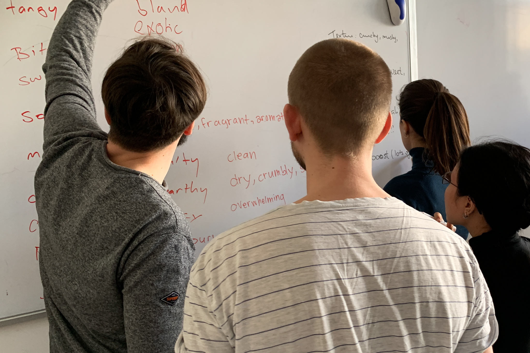
- Internal interviews and workshops with the culinary team to learn how they think and talk about taste and flavours.
- Desk research into existing customer feedback through recipe reviews and support requests, as well as scientific papers around taste preferences, language, and dietary routines.
What we learned
We landed on some compelling insights from the research.
First, we realized that most people use the type of protein as the highest category for food.
Then, we identified some broad categories of subjective “taste” that might be measurable. Most terms we use to describe taste and flavour have affinities, but those are based on context. Bitter is bad when it comes to wine, but good when it comes to chocolate. Mushy is bad when it comes to steak, but great when it comes to mashed potatoes.
I also discovered that people often use emotional adjectives to talk about their favourite recipes and meals. They’d describe them as “rustic,” or “homestyle,” or any other number of terms that pack a lot of emotional meaning into a single word. These terms tend to encompass several desirable qualities of a recipe. I realized these emotional adjectives tend to have dimensional pairs, and users tend to have clear preferences towards one or the other. Take, for example:
- Homestyle – Adventurous
- Hearty – Light
- Rustic – Refined
I also learned a fair bit about how a machine learning model would come up with recommendations. It was clear that that any useful machine learning model would need every possible data point to provide meaningful, personal recommendations.
This gave us a starting point for understanding how our users think and talk about food and taste, and the underlying technical needs that we needed to support.
Defining design
Based on the research, I defined a design phase that would answer questions around asking questions:
- What questions provide the most value to us for the machine learning model?
- Which question formats are most effective for collecting accurate taste preferences from users?
- How many questions do we ask so that users feel they’ve shared a meaningful—but not overwhelming—amount of information to receive accurate recommendations?
Based on our discovery insights, I began a process of rapid design ideation and testing.
Design
The ideation phase started with a slightly different problem statement: “How might we understand our new customer’s taste preferences, so we can offer them recommendations they’ll love in their first box?”
I knew from our research that everything to do with personal taste preferences is relative and situational. The highest level, it’s “what they can eat” at any time. At a lower level, it’s “what they prefer to eat,” both in general and in the moment.
I dug into rapid design ideation around how we could ask for meaningful, data-driven feedback around taste preferences, exploring different question formats.
I used paper prototypes to test questions and how to ask those questions with people who were not current or previous customers, as well as newly-joined team members. In addition to qualitative feedback from test sessions, I also used a simple survey to evaluate the perception of the questions and format. This helped me to iterate very quickly towards a promising solution: the “taste wizard.”
One of the technical constraints was that the design solution couldn't affect the existing signup funnel. As a result, the taste wizard would appear immediately after new customers signed up, but before viewing their first box or choosing recipes.
One of the key findings early in the testing was that any recommendation engine is a “black box.” It’s hard to predict how my response is going to be used to come up with an outcome. That meant that any design solution needed to give users confidence in exactly what they were responding to, and that their answer wouldn’t “lock them in” to get the same thing all the time, like always getting recommendations for the last thing you bought on Amazon.
The “taste wizard” became a three-step flow:
- Protein preferences
- Emotional adjective pair sliders
- Meal affinity
The absolute minimum that we needed to provide accurate recommendations reflected the highest level of preference: “What they can eat,” which is primarily defined by the type of protein.
Then, people have the opportunity to provide feedback around their preference between pairs of emotional adjectives. Most people don’t always like “hearty meals,” but they usually prefer “hearty meals” over “light meals.” By using valueless dimensional sliders, we give people a way to respond based on “gut instinct.”
Finally, we learned that the machine learning model would benefit from having feedback based on actual recipes we have in our catalogue. This ended up being one of the most challenging parts of the design process, and resulted in a highly intuitive, effective, and sustainable outcome.
A peek inside the iterative design process
One of the most challenging UI design elements in this project involved the meal affinity step.
In early testing, I quickly learned that simply asking for “yes” or “no” answers wasn’t good enough: people weren’t always sure how to answer because of the black box effect. If they said “no” to a recipe because they don’t like one aspect of it, such as the asparagus in a steak recipe with asparagus on the side, would that mean that they’d never have steak recommended, even though they love steak?
This, combined with the actual interaction model around responding to recipes, challenged me to explore several very different design approaches. Each iteration responded to challenges inherent in each iteration.
Ultimately, I tested an approach that was similar to a mini-Likert scale. We would only show recipes that reflected their choices earlier in the wizard. Then, we’d ask them to respond with either “I like it,” “I love it,” or “Not for me.” It was easy to understand, accessible by default, and adapted well to all device sizes.
For the sake of brevity, mobile versions have been omitted.
Iteration C
An early design approach explored a set of dishes that could be tapped once or twice to indicate “like” or “love.” This direction seemed promising, because it’d provide extra feedback for the model by also comparing relative responses between recipes, not just a single recipe.
Iteration E
One of the tradeoffs of resizing meals on tap meant that they weren’t easy to view in their “untouched” form. A later iteration tried adding iconography over the dishes rather than resizing the dish itself.
Iteration F
For the sake of accessibility and predictability, a label was necessary to indicate “affinity state” during interaction. Otherwise, it was too easy for users to become confused about what the current state was. In response, I explored several variations that used heart icons and label combinations to respond to interaction events.
Iteration H
At a certain point, I decided the exta data value out of relative affinity wasn’t worth the tradeoff in interaction complexity (particularly on mobile devices). The data team agreed. Instead, I began exploring variations that would only show a single meal at a time, while also making the interaction model simpler and more intuitive.
Iteration J
For desktop and tablet devices, I began to explore a different, more natural layout (for left-to-right readers). This Iteration was taken into more extensive testing with users.
Iteration L
As the design converged on a single promising solution, I refined the overall approach to reduce visual weight. Progress indicators (which gave users expectation around how long it would take) moved into an auto-advancing progress bar, and the button options and layout was simplified.
The result
The final UI design uses subtle UI animation as a microinteraction opportunity to make interation feel immediate, “significant,” and chipper. It adapts seamlessly to mobile and tablet environments.
One tradeoff along the way: I ended up switching to a simpler, more traditionally-cropped recipe photo. This wasn't ideal, as the staging of a photo can influence how the recipe is perceived. However, creating isolated dish photos proved to be a logistical challenge.
Finally, how do you feel about these recipes?
Help us get a sense of what kinds of recipes you like!
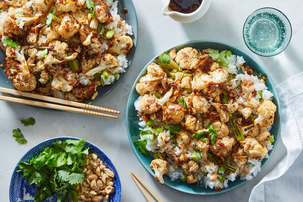
Kung Pao Cauliflower
with Edamame Rice & Peanuts
Meal affinity wizard created in React by Quinn Keast for the purpose of this case study.
Finally, I introduced a “generating” step between the end of the wizard and the first use of the dashboard. Much like airline ticket searches, it reinforces that something is happening behind the scenes based on their actions, and connects the recipes that appear in their boxes by default to their own taste preferences.
Along the way, I planned and conducted more than 30 user testing sessions with new and current customers to validate the design direction. Insights from these sessions—both immediately applicable and those more broadly applicable outside of the scope of the project—were socialized throughout the organization.
Results
450,000+
weekly recommendations
30+
user research sessions
The “taste wizard” launched to Marley Spoon’s global audience and is now collecting useful, meaningful feedback from all new customers during their first experience, powering more than 450,000 recipe recommendations each week. Initial data suggests that the recipes recommended to customers are at least, if not more, accurate than recommendations based on culinary rankings.
The next step of the overall project is to introduce greater feedback mechanisms and continue to refine the specific attributes used to inform the machine learning model, with the goal of ultimately predicting customer choice outcomes on a weekly basis.