In June 2021, I gave a talk to a group of designers, product managers, and developers at Ecosia.org for their Ecosia Accessibility Day.
•••
Hi folks! Great to be here today. I’m really happy that the Ecosia team is coming together for an event like this—it’s a great idea and something that I’d love to see embraced by companies everywhere.
I’m going to be talking about inclusion as a catalyst for design. I figure I’ll take about 30, at most 40 minutes to run through some thoughts, and then we’ll have plenty of time for extra discussion
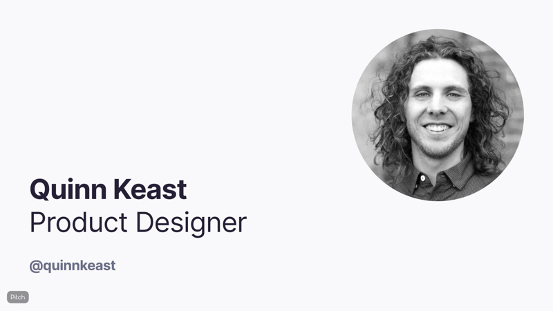
For those of you that haven’t seen my face before, my name’s Quinn Keast, and I’m a product designer based here in Berlin. I’m currently working with a startup called Sourcegraph, a universal code search tool. I’ve been kicking around in design for something like 11, 12 years, and the whole topic of inclusion and accessibility is really close to my heart. More on that in a moment.
Just a quick disclaimer as I jump in: this whole talk reflects my personal opinions, and there’s a good chance I’m wrong about some things and will make mistakes. When it comes to inclusion in all of its aspects, I’m still learning and evolving!
When I was asked if I’d like to talk about accessibility for a group of designers, it got me thinking! Whenever I’ve talked about this theme in the past, it’s invariably been for a group of folks with really varied roles and experience, and I’ve always tailored it to focus on two themes: the ethical underpinnings, or why it’s so important that we make the things we make accessible, and the technical implementations, showing folks how to go about it and how all the tools they need to deliver accessible products are right there and easy to use and reference.
For today’s event, these themes didn’t really seem to hit the spot. For a team of designers, I wanted to think more deeply about our role as designers and how we can bring best these ideas into the earliest stages of the design process.
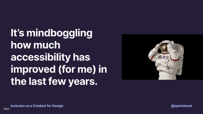
A bit of a personal story to get us started: it’s absolutely mindboggling to me how much accessibility has improved over the last few years. Here’s a quick personal story.
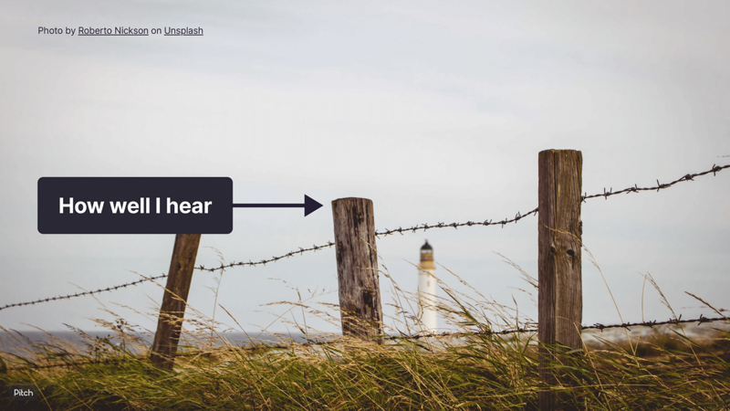
I’m deaf as a post. I’ve had profound hearing loss pretty much my whole life. I wear hearing aids, and with those on, I can hear sound, like our voices and the inflections and our tone, the world around me, but I can’t draw words out of what I’m hearing. I rely totally on lip reading in my day to day life.
About three years ago, my partner and I decided we wanted to move from Winnipeg, a small city in Canada famous for being very cold, to Berlin, famous for also having bears, among other things. When I started looking for a new role while still in Canada, all of the interviews were over video calls. And it was… not easy. I couldn’t understand folks over the calls, so we’d do a little dance where the interviewers would write out everything they wanted to ask or share as text messages, while I’d respond over the call as usual. This was a long, slightly awkward process helped along by a lot of amazing, thoughtful folks on the other end.

Today, I’m working for a company that’s fully remote and globally distributed. Every single day, I’m doing calls, running workshops, conducting job interviews, doing user testing and customer interviews, even doing conference talks and whatever else I want to do.
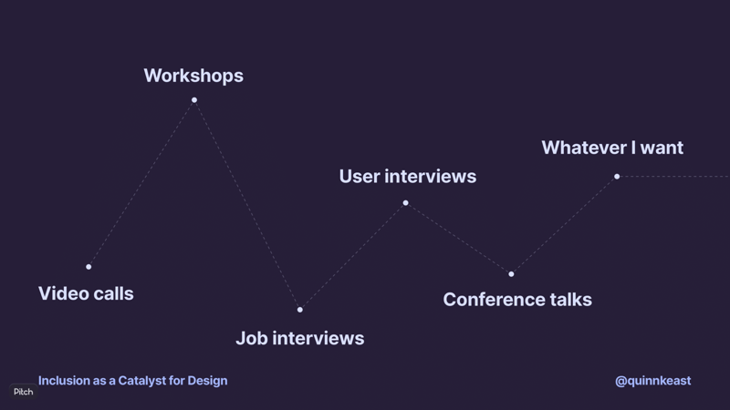
In just three years, my ability to thrive in a remote environment has totally transformed. One day, speech-to-text technology hit a tipping point where it was just good enough, and a new world opened up to me.
In this story, a series of inclusive decisions on the part of the team behind the video calling platform lead to an accessible outcome.
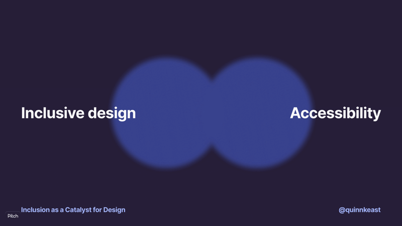
One of the challenges about talking about inclusion and accessibility is that there’s a bit of weird blurring between the two, and then the ideas start being used interchangeably or to mean the same thing.
Unfortunately, this then leads to some themes around “accessibility” in tech today that aren’t so great.
The first is that accessibility is left mostly as the responsibility of developers, as part of implementation. We have these incredible guidelines and specs like WCAG that tell us how to implement products accessibly, but it’s a challenge when “follow the guidelines while implementing it” becomes the default “focus” or takeaway for creating accessible product outcomes.
The second is that it sometimes feels like design’s responsibility is relegated to things that can be evaluated with tools, like colour contrast ratios. This is, of course, a super important part of the whole, but it’s artificially limited in its impact.
And third, most importantly, work is done backwards to meet accessibility criteria after, or only while, something’s being built. All three of these themes tangle up with each other to create other implications: when accessibility is the responsibility of developers (and designers), the whole topic is pretty unknown to the rest of the organization. Internal critera and requirements around accessible outcomes may not be shared team-to-team. The goal of delivering accessible products may, instead of creating inclusion, aim to meet legal compliance.
Together, these themes frame and reinforce accessibility as “separate feature,” rather than as something intrinsic to the product.
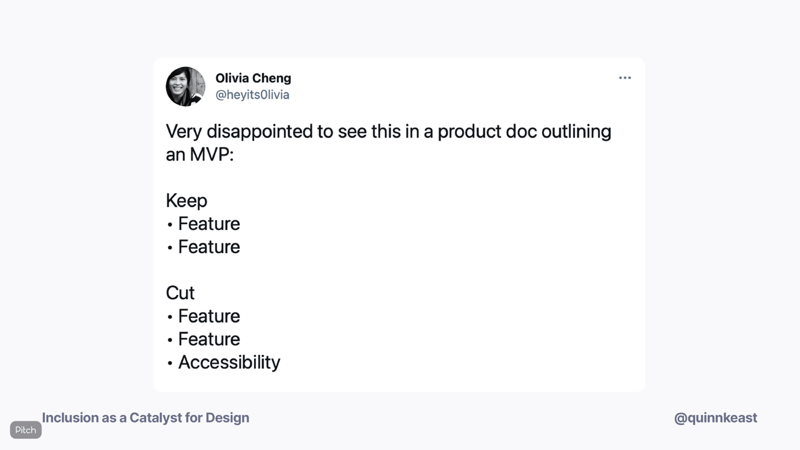
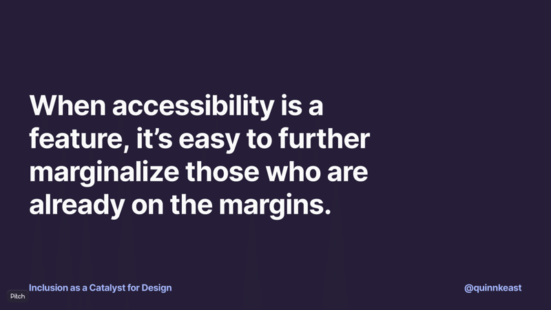
And this is really dangerous, because when accessibility is a feature, it’s easy to further marginalize those who are already on the margins. How many of you have heard variations on these statements?
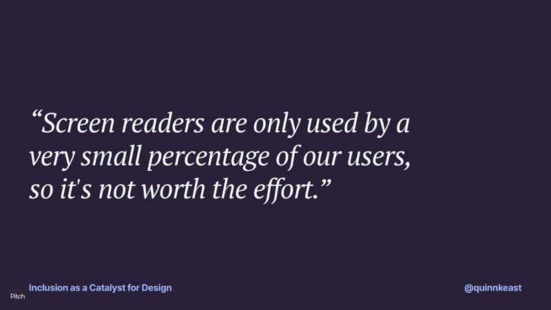
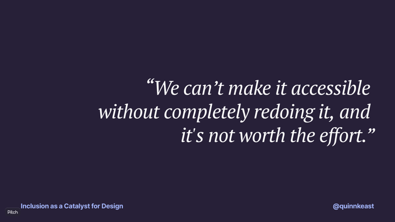
For someone living with something like hearing loss, for me, these statements boil down to “People with hearing loss are not worth the effort.” It’s not an abstract. It’s a specific and purposeful choice to exclude folks because they’re not worth it. And now, my most controversial and personal paradox: I get it.
Part of being an effective product designer is about really understanding both the user and business needs and contexts. When someone says “we can’t make it accessible without completely redoing it and that’s not worth the effort,” that’s bad, but also that may be true.
When things aren’t going great with something, it’s a good technique to zoom out a bit and take a look at the broader context. Why isn’t something going great? How does the environment and context provide, or take away, support? Simply put, I believe we’re not setting ourselves up to consistently deliver accessible products.
As an industry, we’ve been working on the business case for accessibility for a while. A large part of our effort is focused on helping others in our organizations to understand that accessible outcomes benefit a lot more than just the folks with the most significant needs.
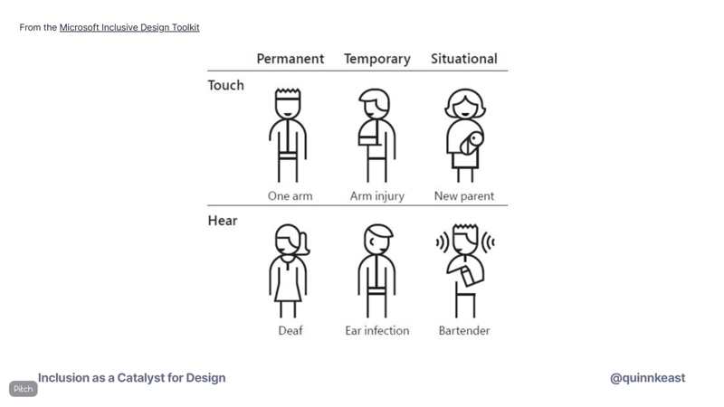
The Microsoft Inclusive Design toolkit is a stunning resource—if you haven’t seen it before, be sure to check it out—and really helps folks to build the mental models they need to understand the wider impact of delivering accessible products beyond the most extreme examples of themes of need.
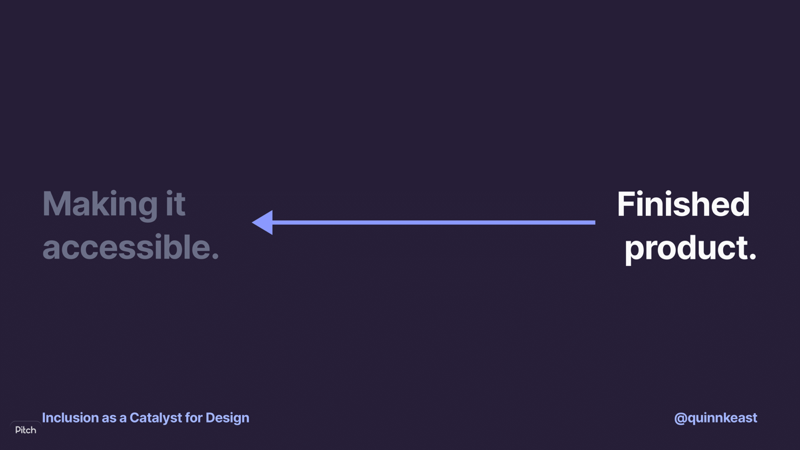
But all too often, we look backwards. We take finished products, and then figure out how to make them accessible. This just leads to conversations where accessibility is a feature to be cut or eroded, and sets us up to have to argue why people are important, and why we should include them.
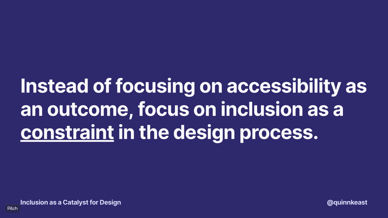
Instead of focusing on accessibility as an outcome, we can focus on inclusion as a constraint in the design process.
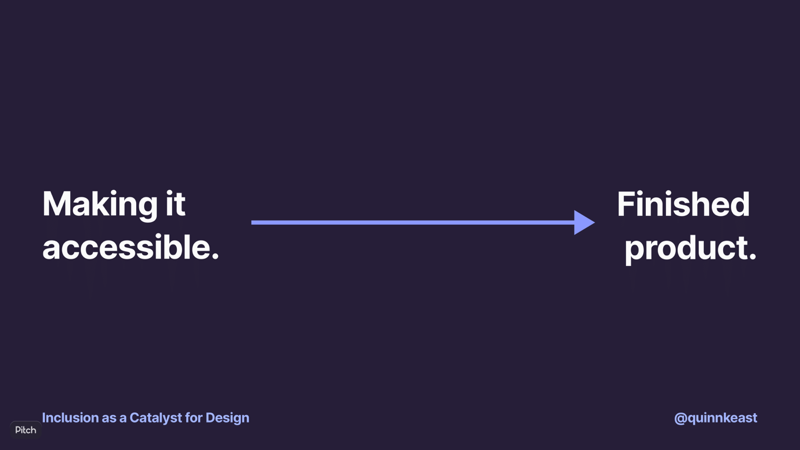
As designers, we’re in a really unique position of being able to work forwards by designing inclusively as part of the design process.
Constraints are catalysts.
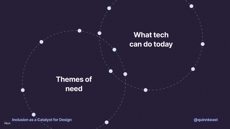
From the earliest stages of our work as designers, we can introduce constraints by bringing together themes of need with what tech is capable of today.
If we get it right, it means that accessibility will be intrinsic to the product. It means that accessibility can’t be a feature, because the product is defined by the choices that made it accessible.
I’m going to jump in to a specific example that’s completely unrelated to digital products, because it lets me really highlight this point in a few ways.
These here are some OXO peelers. OXO products slap. I was delighted to learn that the first OXO peeler is the perfect example of inclusive design.
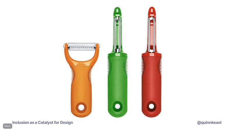
The designer’s partner had arthritis in her hands, and she found it difficult to use the typical peelers at the time, which were some variant or another on these unsightly metal messes. So the challenge for the designer, Sam Farber, was to make a peeler that would be easier to hold and grip.
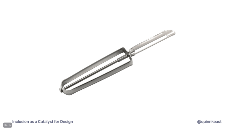
Now, you look at these two peelers, and you can see how there’s a nice clean evolution from the simple metal peeler to the nice, easy-to-grip OXO peeler.
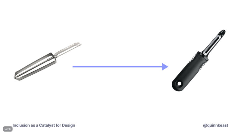
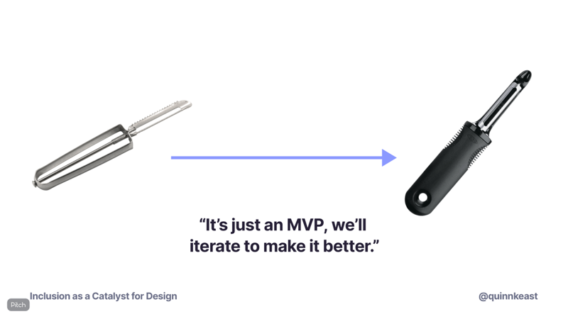
I can even imagine a conversation happening where a company launches the metal peeler, then says that it’s just an MVP, and they’ll iterate to make it better. They absolutely could do this! But there’s two problems: first, going from that metal peeler to that OXO peeler would take a heck of a long time, and despite categorical similarities, it’s a fundamentally different product. That’s a hard sell for any company. And second, during the whole way from the metal peeler to eventually reaching the OXO peeler, it’s a peeler that’s hard and painful to use for a swath of people that it’s excluding.
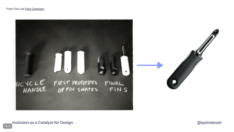
The actual OXO peeler was designed inclusively from the very beginning. It was an iterative process that identified a theme of need and set out to solve that need. Here’s a photo of the iterations directly from OXO, which I find absolutely hilarious. A bicycle handle as the very first iteration is a gigantic improvement over the metal handles, and it’s literally just a bicycle handle! The OXO peeler is a beautiful example of design working forward. You cannot separate accessibility as a feature from the peeler: it’s intrinsic to the peeler, and defines it to its very essence. There were many other parts of the design process that focused on other constraints and goals—for example, in this photo you can see it’s mostly focused on the “fins,” which was in part a design affordance to make it super intuitive how to hold the peeler—but since inclusion was a constraint in itself, it affected the outcome in a significant way.
But let’s take a look at two examples more specifically in the digital-product landscape. These are both personal experiences and show the contrast between going backwards and going forwards.
The first example is from Sourcegraph. Sourcegraph is a mostly Enterprise-focused tool for companies that have a lot of code. We’re talking at the scale of Dropbox, PayPal, and Uber, where they have millions of lines of code in lots of different places. The tools developers use to read and navigate code on their own systems are great, but often limited to the project they’re working on. When you’re at this scale of code, that local tool workflow doesn’t work so great for finding and navigating things.
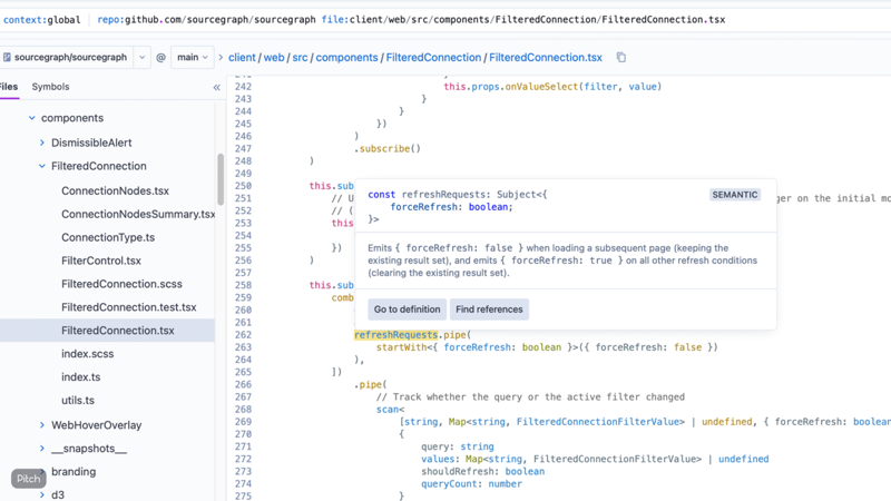
One of Sourcegraph’s key features is the code intelligence. You can go to a function in a code file, and see exactly what it does, where else it’s used, and jump between files to wherever that original function is located. That’s a big help for developers… as long as they can use a mouse or trackpad to hover over a definition. Sourcegraph wasn’t really designed from the beginning with inclusion as a constraint, and so we have some serious gaps in accessibility that we’re working really hard to address. This is one of those gaps: we need it to be possible to trigger these tooltips without relying on a mouse or trackpad. Solving this will benefit the 1.1% of developers who have vision loss or have difficulty seeing, and it’ll also benefit the giant percentage of developers that like to use their keyboard as much as possible.
But unfortunately, we’re working backwards. We have the culture and the appetite, we have the expertise and the motivation, and we even have a plan: but since we’re going backwards, we have to find the space to get it done.
And in a startup environment, it’s a constant reality that space is hard to find.
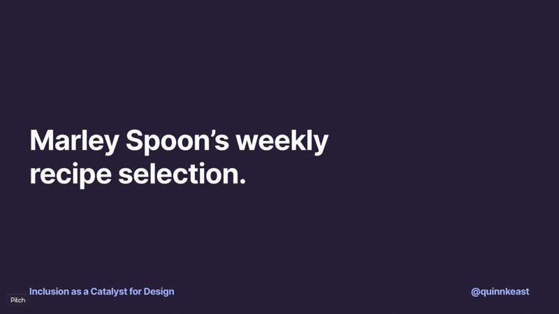
In contrast, we have another example from Marley Spoon, a meal kit company. Each week, you choose the recipes you’d like to cook, and the company delivers the recipes and all the ingredients you need right to your door. A while back, Marley Spoon realized that its mobile platform was at an unsustainable level of tech and design debt to the point where it would prevent the company from exploring new opportunity areas, and decided it was time to revisit the app from the ground up.
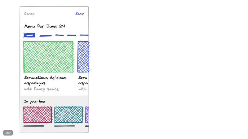
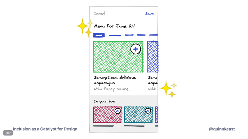
One of the key sections of the new app was the weekly menu builder. Customers can view all the recipes available for a given week, and choose which ones to include in their box. As this was a key part of the experience and a big strategic area for driving future business, the design team spent a good amount of time exploring this section. In this design exploration, the team looked at novel ways to interact with recipes and box.
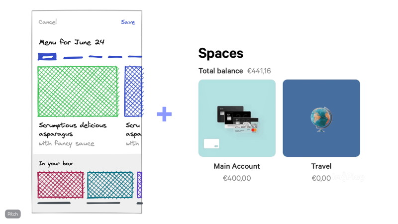
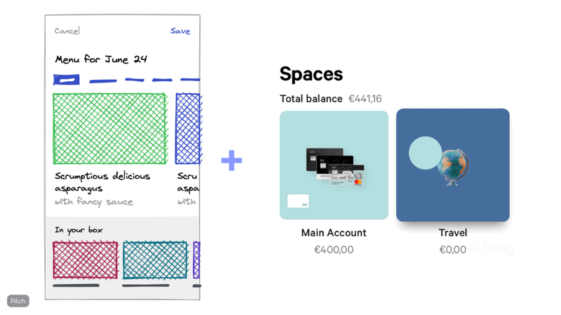
One really promising direction was an N26-spaces-style drag-and-drop, where users could tap and hold momentarily on a recipe, and then drag to their box to drop a “copy” of the recipe into their box. It felt fresh and intuitive, and there were lots of little bits of the interaction that made it a fun activity.
But when the design team thought about what assumptions this interaction made about how people would be engaging with the app, we realized that for some users, such as those with motion disorders like Parkinsons, the whole thing would be very hard to use, because it assumes fine motor control. A user would need to hold the device steady, tap and hold on a recipe, and then drag to another part of the interface without losing contact with the screen.
So the design team challenged ourselves to use inclusion as a constraint, and revisited the interface to create an interaction flow that would be inclusive for a wide range of needs, meaning that a single tap would be able to trigger any action or flow.
And then, when the team looks at adding the drag and drop interaction, the business case is making it better, not making it accessible. And that business case is much easier to make.
However, it’s not always as clear as working backwards or working forwards. The earlier we say that inclusion is a constraint, the easier it is to use as a catalyst for better, inclusive design.
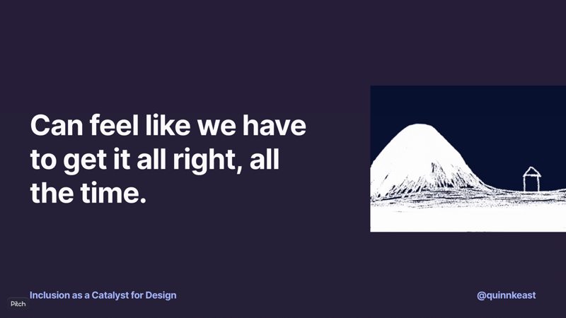
But one of the scary bits of the topic of inclusion and accessibility is the feeling that we’re obligated to get it totally right all the time. I suspect it’s one of those background anxieties that many of us struggle with, and often just end up avoiding as a result. But, we aren’t going to, and we don’t have to, get it right every time.
We’re all learning and evolving. As uncomfortable as it can be to realize we’ve made a mistake, it helps us learn and do better, not only for ourselves but for our whole team.
I’d like to share one more example of just this. It’s not my own story, so I’m not going to name names, but the protagonist was happy to let me share it with you as an example of this uncomfortable space and what unfolded.
This particular product is a mostly visually-driven no-code tool to automate processes that would usually need to be coded by developers. The key interface in this product is very visual, using drag-and-drop building blocks and connections to create flows. The designer in question was working on a new product feature that was along the lines of a database, separate from this key interface but an important part of their product vision.
In an early round of feedback in the design process, someone mentioned that it didn’t feel like it was part of the overall product. The designer’s response was to take inspiration from one of the key interface’s drag-and-drop style and make a somewhat spacial interface.
This was well-received and was clipping along...
... but then someone on the team had the courage to say:
“This isn’t accessible.”
It was a real oh-shit moment for the team.
Although it was late in the process, it was still in design. The designer ended up stepping back, challenging their own work and thinking through how they could capture the same “belongs with the rest of the product” feel while also keeping it accessible from the very beginning.
They told the team why they were going back to it, what the new constraints would be, and then returned with a new, even better approach that brought together accessible baselines with the best ideas from the original approach.
I love this story, because it shows many things: how we don’t always get it right the first time, how it takes courage for someone to push back, how an environment built around trust and shared inclusive values helps a team embrace and act on feedback, and most of all, how treating inclusion as a constraint is a catalyst for better outcomes where accessibility is intrinsic to the design.
So how do we bring these ideas into the design process? There’s a few key techniques. The easiest, most immediately actionable technique is to get into the habit of asking during our design process...
... “What assumptions are we making about how people will engage with this?”
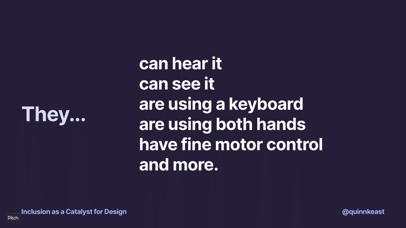
Some assumptions: that they can hear it. That they can see it. That they’re using a keyboard. That they’re using both hands. That they have fine motor control.
Then, we can ask: how might we solve that with the tech available to us today?
Sometimes, the answer is found in implementation, which is where the WCAG guidelines come in. Other times, the answer is found in the design process and in how the interactions or product works as a most fundamental level.
Next, we can use these kinds of constraints to keep each other accountable in design. This makes the biggest impact in the design critique and review process, and it’s something anyone can do—designers, developers, product managers, and so on. The key is to get these feedback loops going in design so that it’s a constraint, instead of trying to fix it or add it to something that’s already there.
This doesn’t mean we can’t fix things that are already built, but we can build momentum and practice by bringing it in to everything new we’re doing. This then has a multiplying effect, because the more we do this, the more accessibility becomes instrinsic to the product.
One last thing.
I’d like to cycle back to the story about video calling. Let’s suppose that we’re back in time by five years, and on a team working to make a new video calling platform.
We’re using inclusion as a constraint, and we realize that we’re making the assumption that people will be able to hear the call. So we ask, how can we solve that with the technology available to us today? In the story I shared about interviewing for roles overseas, they’d solved it.
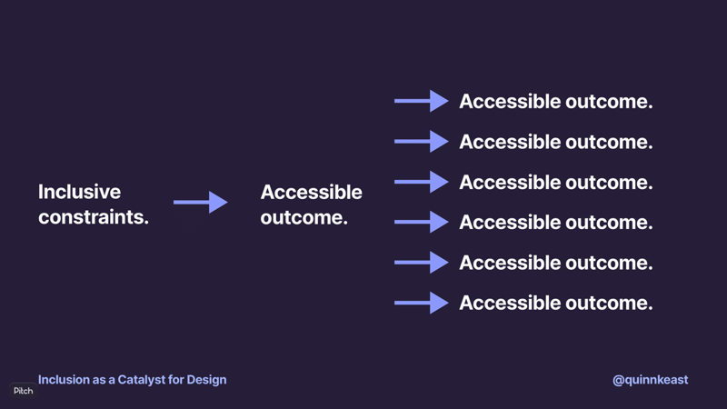
They included instant messaging as a first-class feature. I was able to have meaningful, deep conversations with a lot of great folks across an ocean, despite not being able to hear them on the calls.
Technology enables new accessibility outcomes. But usually, we’re working within problem spaces that don’t include inventing new technologies to support accessibility. If we were working on this video calling platform five years ago and someone said, “We must provide speech to text to make it accessible for folks with hearing loss,” there’d be some pushback—and honestly, I’d agree with that pushback, because speech to text is one solution to the problem, five years ago real-time speech to text was a new problem space with huge challenges. But by recognizing the assumptions and the moments of potential exclusion, we can find solutions with the tech that’s already available to us today.
And when the next gigantic leap in technology opens up new solutions for creating accessible outcomes, we as designers can bring those new opportunities into our work.
We’re in a unique position to keep changing what we expect of ourselves and our colleagues in the tech industry. I saw a great quote from someone about accessibility in video games, which is a space that’s been evolving in phenomenal ways:
You, through your work, can change people’s lives. Bring inclusion into your work and use it as a catalyst for better design.
