
It is mindboggling how much inclusion and accessibility has improved year over year.
I’m deaf as a post. I’ve had profound hearing loss my whole life. I wear hearing aids, and with those, I can hear sound, like someone talking and their tone of voice, but I can’t draw words out of what I’m hearing. I rely totally on lip reading in my day to day life.
When my partner and I decided we wanted to move from Canada to Germany about six years back, all the job interviews I took from my desk in Canada with teams in Germany were over video calls. Six years ago, having profound hearing loss and doing interviews over video calls was not easy. There were no reliable speech-to-text tools, so I simply couldn’t understand folks over the calls. We’d do a little dance where interviewers would write out their questions and comments in text messages, and I’d respond out loud as usual. I met a lot of really phenomenal, thoughtful folks along the way, because one has to be phenomenal and thoughtful to make that work.
My last couple of roles have been remote-first, with distributed teams. Every single day, I’ve been doing customer calls, running workshops, interviewing folks for roles, and even giving conference-style talks remotely.
Every time I stop and think about this I’m just blown away. One day speech-to-text tech hit a tipping point of being just good enough, and my world changed under me.
In the context of digital tools and services, we can do so much to create inclusion through accessibility.
But I think we can do even more if we treat inclusion as a constraint in design.
It’s hard, sometimes, talking about accessibility as a designer. There’s a blurring of the concepts of inclusion and accessibility that leads to the ideas being used interchangeably, and what I feel is a level of distortion of anticipated effort and breadth.
I find “accessibility” is left mostly as the responsibility of developers during implementation. There’s great guidelines like WCAG that tell us how to go about this in a way that results in accessible outcomes, and dev tooling can bring feedback right into the IDE. Similar tooling is also there for designers to do things like check colour contrast ratios to meet guidelines during visual design.
But “following the guidelines” isn’t in itself the whole of creating accessible products, and tends to mean work is done backwards to meet the criteria after, or only while, something is being built.
This creates other implications: accessibility becomes the responsibility of developers and designers alone. Internal criteria may be different from team-to-team. Implementing accessibility warps around hitting minimums.
These implications together frame and reinforce accessibility as a separate feature, rather than as something intrinsic. And that’s dangerous, because when accessibility is a feature, it’s really easy to justify further marginalizing those who are already on the margins.
As an industry, we’ve been working on the business case for accessibility for a long while. A lot of effort has gone into helping organizations understand that accessibility benefits a lot more than just the folks with the most significant needs.
Take speech-to-text in video platforms. On one end of the spectrum, you’ve folks like me who can’t understand speech at all on calls. That’s a permanent disability among a small (but growing) percentage of the whole audience using video platforms. But some folks have situational or temporary disabilities—someone might have construction next door, or perhaps they have an ear infection. There’s even folks who may be speaking a second or third language, and find speech-to-text helpful for navigating their own calls. The Inclusive Design Research Center reframes disability as a mismatch between the needs of a user and the design of a product or system.
The problem is that, in practice, we too often look backwards when we’re making the business case for accessibility. We take defined or finished products and then try and figure out how to then make them accessible according to the guidelines. This is a hard case to make, and sets us up for arguments around when and why to invest in accessibility. And these arguments are tough.
When someone says it’s not worth investing in building speech-to-text because only some small percentage of users have hearing loss, there’s a pragmatic cost-benefit tradeoff to be made with the business in mind. But at the same time, for those living with hearing loss, it’s not about cost-benefit tradeoffs for the business. When someone decides to skip accessibility, they’re also deciding to exclude someone. And that’s tough! None of us are setting out with the intent to exclude other humans. But when accessibility is viewed as a feature, someone has to make the decision to keep or cut that feature.
We already have the concept of inclusive design and barrier-free design: the idea that a product, service, or environment should be designed—from the beginning—to be usable by as many people as possible.
I think we can even more precisely state: inclusion should be a constraint on design.
We use all kinds of constraints when we’re shaping products and features and projects. Some are technical, some are systematic, some are subjective. Each constraint shapes the direction of our ideas.
The best constraints force us to explore new, better directions.
Constraints are catalysts.
When we introduce inclusion as a constraint, it means that accessibility can be intrinsic to the product. It can’t be a feature, because it’s not separate—the outcome itself is a product of the choices that were made within that constraint.
I keep going back to OXO peelers. OXO peelers are rad. I was delighted to learn that the first OXO peeler was an example of inclusion as a constraint in the design process.
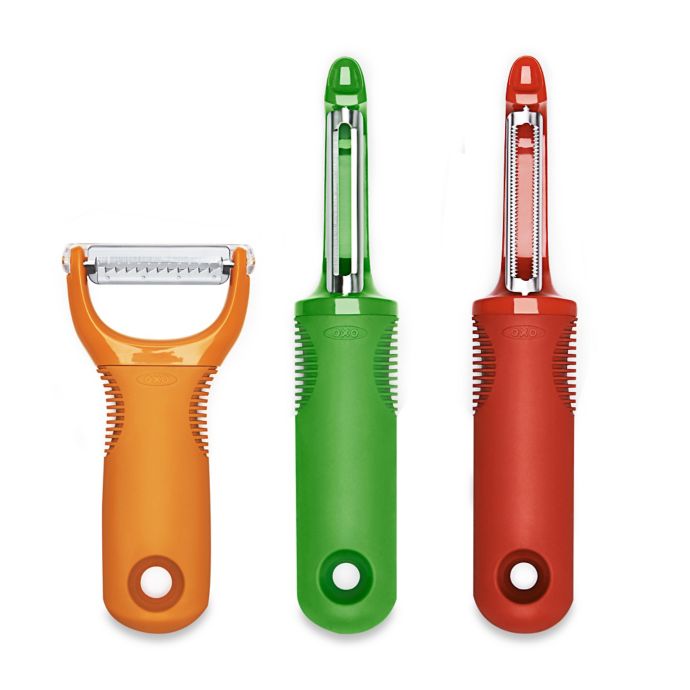
Betsey Farber, one of the folks involved in designing the OXO peelers, had arthritis in her hands, and found it difficult to use the typical peelers at the time, which were some variant or another on a metal mess. The challenge was to make a peeler that would be easier to hold and grip.
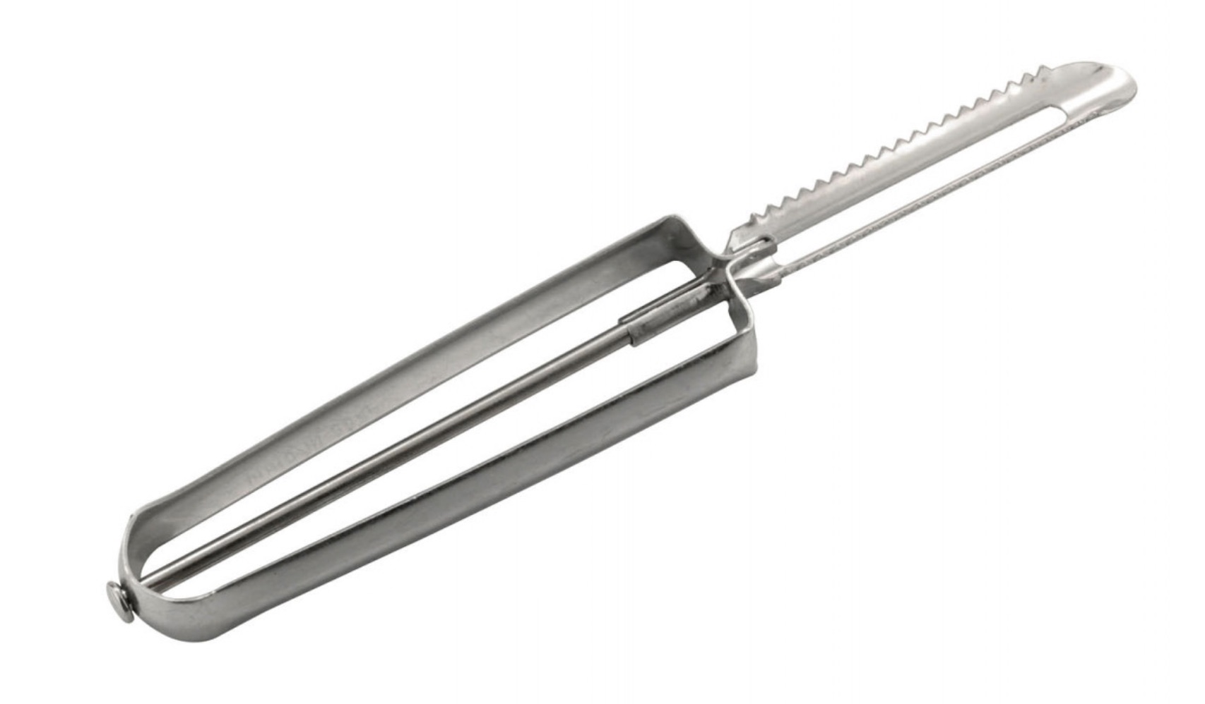
I can easily imagine a conversation where a company launches the metal peeler, says it’s the MVP, and says they’ll iterate to make it accessible later. Possible! But two problems: first, going from that metal peeler to the OXO peeler would take a long time. All the assumptions and effort that went into shipping that metal peeler would have to be revisited and rebuilt, because despite categorical similarities, it’s a fundamentally different product. And second, the whole time it’s iterating towards being an OXO peeler, it’s a peeler that’s hard and painful to use for a swath of customers.
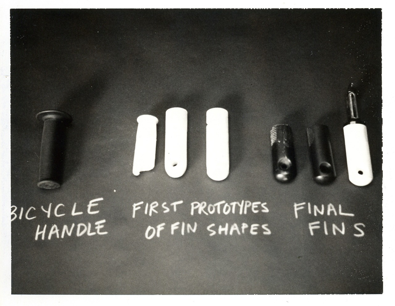
The actual OXO peeler was designed with an iterative process rooted in a theme of need. The true MVP is the bicycle handle: the minimum possible that solves the problem within the inclusive constraint. Accessibility is intrinsic to the resulting product: you can’t treat accessibility as a feature to be considered, because accessibility is part of the product’s very essence. If it weren’t accessible, it wouldn’t be an OXO peeler.
Here’s another, more personal example in a digital product space. I worked on a product for a meal kit company. This product had the concept of rotating menu of recipes that a user could add to the weekly box shipped to their door with the recipe and all the ingredients they needed to cook with. We were redesigning the UI for choosing which recipes were in the box.
One promising direction involved a tap-and-hold, then drag, from the recipe thumbnail to the box. We prototyped this out and it felt fresh and intuitive, and little bits of the interaction made it feel fun to use. But when the team thought about the assumptions this interaction pattern made about how people would be engaging with the UI, we realized that, as an example, those with motion disorders like Parkinsons would find it difficult to use, because it assumes fine motor control. A user would have to hold the device steady, tap and hold on a recipe, then drag to another part of the interface without losing contact with the screen.
With inclusion as a constraint on the design process, we revisited the UI to create an interaction flow with the constraint that a single tap would be able to trigger any action or flow, without sacrificing the underlying feel we were after.
Rather than working backwards and trying to add accessibility after the fact, the team worked forwards and designed a UI that was intrinsically accessible. It didn’t take any extra work: much like high craft design is not mutually exclusive to working at a high velocity, design with inclusion as a constraint is not mutually exclusive to speed.
The same constraint will shape higher-level product features, not just interaction patterns. When I was interviewing over video calls six year ago, the technology wasn’t in place for real-time speech-to-text as an accessibility solution. But chat text messaging itself as a product feature helped bridge that gap within the constraints of the technology available then.
Using inclusion as a constraint isn’t going to magically solve all of the accessibility gaps in your product or the hard conversations about priorities. But if done well, there will be less of those gaps, and you’ll need to have less of those conversations.
Over time, designing with inclusion as a constraint will have a multiplying effect across the team’s culture and the product itself. And when we’ve internalized inclusion as a shared constraint in our practice, then this multiplying effect will go far beyond our own teams and products.
“Accessibility in gaming didn’t happen overnight. It didn’t happen because of one person or group. It happened because a large number of people across the industry wanted to make games accessible to all players.”
— @stevesaylor