
I’ve just returned from Amsterdam, where I had the opportunity to present at Uber Design Night about what sports, hearing loss, and language can teach us about better communication in our products.
One of the principles for better communication I shared was the idea that the most intuitive experiences deliberately use the scripts that users already hold in mind. Scripts set defaults for props, actors, and settings. They’re a mental representation that helps us anticipate what will happen in a given situation. Essentially, they're mental models that follow a sequence of events.
Take, for example, the script that someone might hold for a self-checkout in a grocery store. First, you tap the screen to start checking out. You scan each item, or sometimes search for and select produce before weighing it. The machine will beep loudly and flash a light to indicate that it scanned something, which you can then place in your shopping bag. (When something goes wrong, like the machine struggling with an “unidentified item” in your bag, you can call over a cashier to help.) Once you’ve scanned everything, you hit “Pay now,” select your payment method, pay, collect your receipt, and off you go.
When something doesn’t follow our script, it throws us off.
During the Q&A session, someone asked a great question:
What do you do when the script goes wrong?
This is an interesting question, because I don’t think we can always respond to a script going wrong after it’s already gone wrong. Instead, it should be our goal to prevent those situations from happening in the first place.
I think there’s two kinds of situations where scripts go wrong: “Stallers” and “Stoppers.”
Stallers
Stallers create friction and confusion for users, but don’t necessarily stop users from getting things done. Usually, Stallers happen when the script isn’t quite right, but it’s also not quite wrong.
This is a self-checkout machine in a national grocery chain in Canada, where debit cards are one of the most popular payment methods.
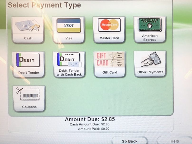
When users finish scanning their groceries, they’re asked to choose their payment method. Debit cards are very popular in Canada, so it’s likely customers will look for that option on this screen. However, this particular interface uses the phrase “Debit Tender” to label the debit card option.
Most people don’t use the phrase “Debit Tender” to talk about debit card payments. And yet, it’s also not entirely wrong.
The user has a moment of confusion and hesitation. They still find what they're looking for and complete their purchase, but it felt a bit clunky. They’ve experienced a Staller.
Eventually, they’ll adapt their script for those particular self-checkouts to include the term “Debit Tender.”
Stoppers
Stoppers, on the other hand, are those baffling moments that jar users out of their flow.
Imagine that same self-checkout. What if, immediately after selecting your payment method, you were asked if you’d like to make a donation in support of a local charity? Even if the request makes sense on its own, it’s well outside of the user’s script for “using self-checkouts in the grocery store.” It’ll stop them in their tracks.
Their first reaction may be, “Did I do something wrong?”
They’ll take a moment to pull themselves together and figure out what’s going on. They may be left with more questions and uncertainty: will they have to choose their payment method again?
And what happens if they don’t even notice, and agree to make a donation while acting on autopilot?
Finding and solving Stallers & Stoppers in your products
Both Stallers and Stoppers can be found by directly observing users interacting with your product in the wild, or during prototyping. Don’t rely on metrics like task success to decide whether or not these situations exist in your products, because while both Stallers and Stoppers can introduce confusion and uncertainty, users are usually still able to do what they set out to do.
While observing users using your products, pay close attention for moments of hesitation. These moments signal that a Staller may be present, giving us clues that something wasn’t quite what was expected.
Stallers can usually be solved by making small changes to copy or design. They make a good target while looking for low-hanging fruit for improving an existing product or prototype.
Case in point: the Staller in the self-checkout’s payment method interface could be chased away by simply changing the label from “Debit Tender” to “Debit” to align with the user’s own language.
Meanwhile, it’s easy to spot when users run into Stoppers, because their response tends to be more dramatic.
Unlike Stallers, Spotters can be particularly tricky to solve, because their presence is often unavoidable due to business goals or initiatives, and often don’t have a clear place within the existing script. Take our self-checkout example: asking users if they’d like to make a donation as part of the process is a wonderful initiative, but it really doesn’t fit anywhere into the script of a self-checkout.
A good way to eliminate Stoppers is to recognize ahead of time that something will break with the script, and provide cues before the script “starts” that will prime users to anticipate going off-script.
With the donation request during self-checkout, this could be done by adding some kind of external signage or a distinct “start” screen promoting the initiative. This, on its own, may be enough to provide cues to users that their script may not be enough. Though they may not know what to expect, they may be primed to pay closer to attention to see how things unfold.
Get your product in front of some users, and watch what happens. Are there any Stallers or Stoppers lurking along the way?