Refining Airplane Studio’s information architecture and design language
Organization
Airplane
Role
Staff Product Designer
Date
2023
Airplane is the developer platform for internal tools. I joined Airplane at the beginning of 2023 as the company’s second designer, shortly after their Series B, working to define the future of internal tooling with a focus on developer-centric concepts and workflows.
With Airplane, developers work locally to build internal tools using tasks, pages, and views in their own IDE using simple JSON or YAML configuration, or can they can code complex workflows and orchestrations using TypeScript, Python, and more.
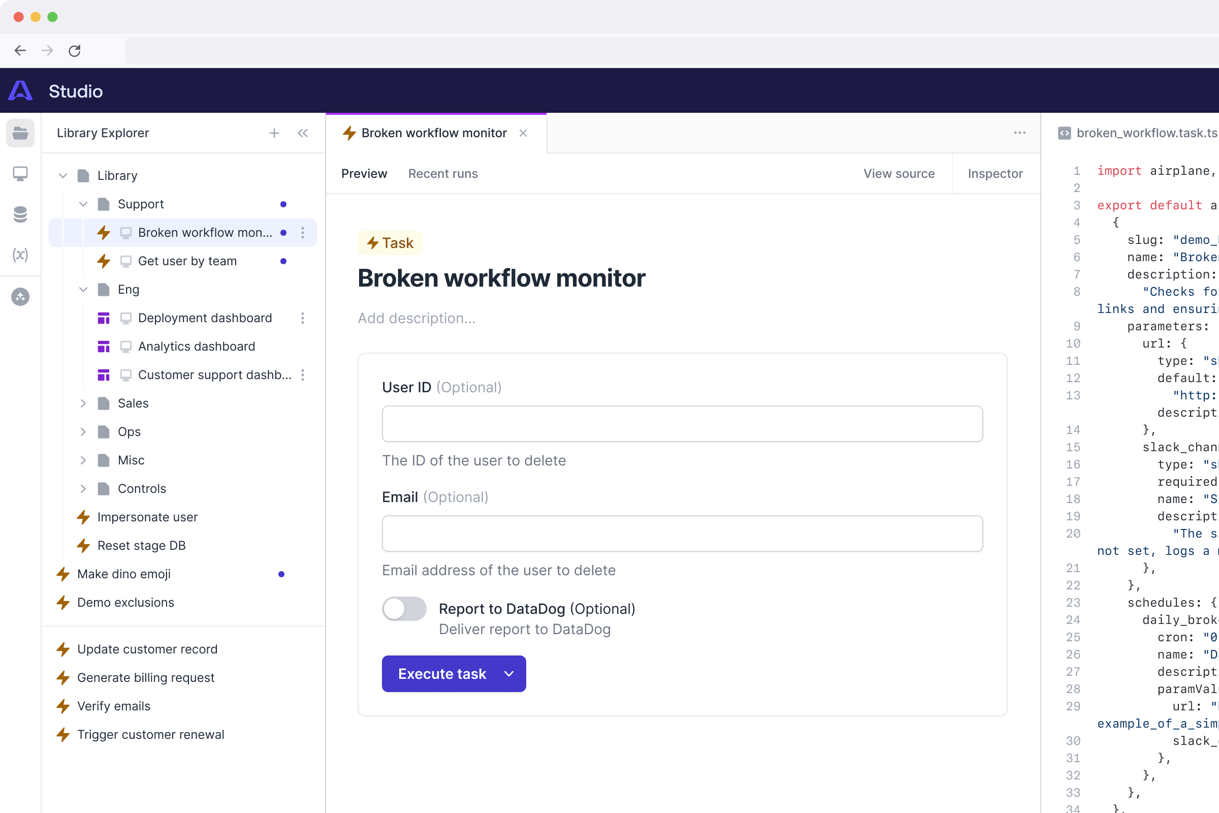
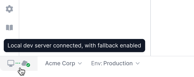
Originally, developers would build their tools locally and deploy them to Airplane to preview and test. This created a painful iterative loop, which led to the creation of Airplane Studio, a local preview tool that would load local tasks and views, updated in real time, and allow for end-to-end execution and validation.
The first versions of Studio were narrowly defined, and weren’t designed on top of a particularly intentional underlying system. This meant that as features were added bit by bit over time, the emergent information architecture and usage patterns became less clear and more undefined, and it became visually disconnected from the rest of the Airplane platform.
While in the midst of working on a roadmap effort around designing a new way of building UIs in Airplane with Pages, I was thinking ahead to the developer experience in Studio.
Studio was becoming more of an alternative editing environment within the Airplane platform, giving builders the ability to preview and and build tasks using UI as an alternative to the IDE. This was strategically important as we worked to speed up the early experience with Airplane—working locally in code was a key value proposition of the platform, but the friction involved in installing the CLI and setting up a local environment was a barrier to adoption.
By making it possible to create and edit tasks in the cloud through Studio, we were working to make it easier for someone to create and run their first task.
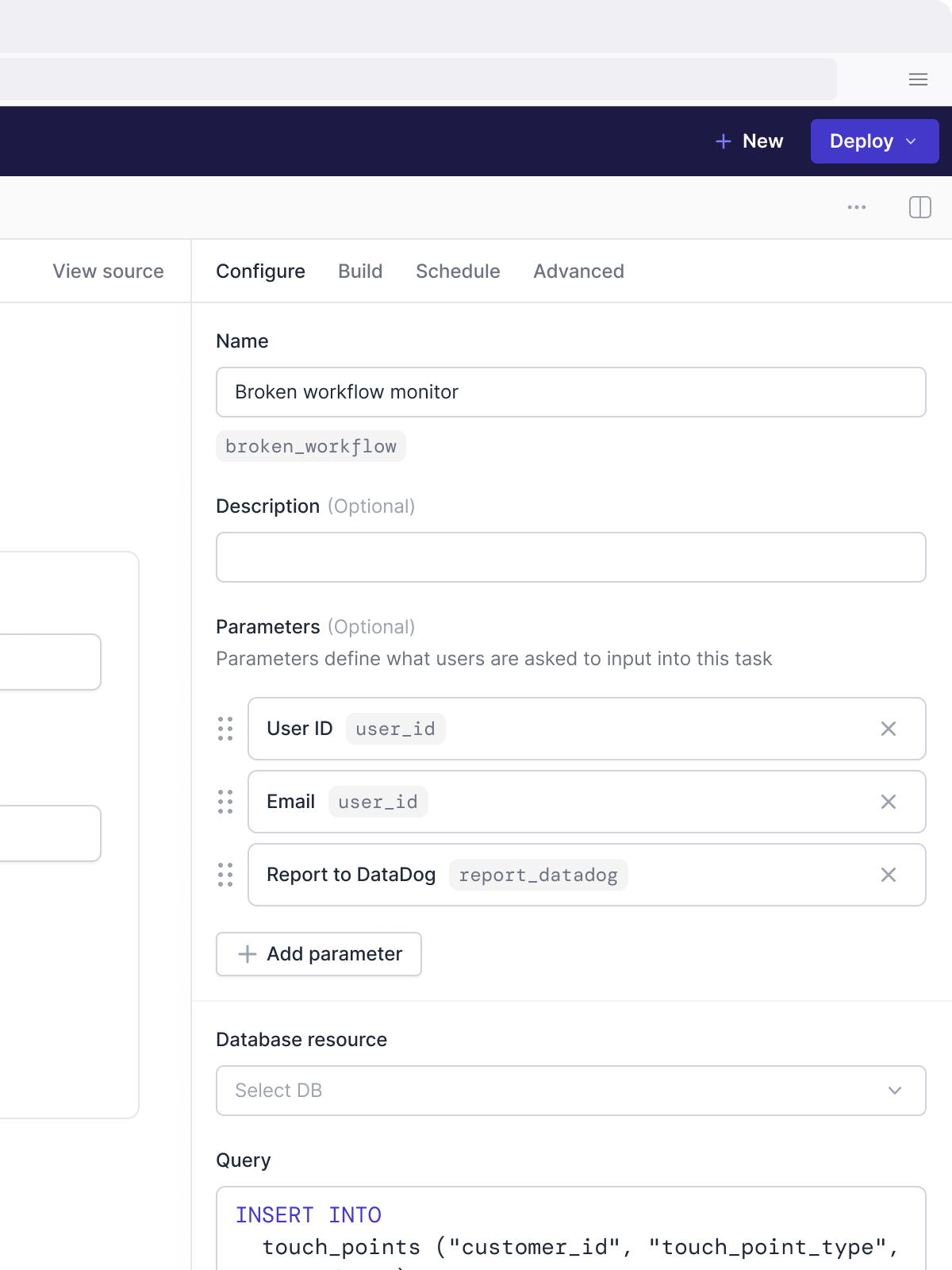
With Pages, we were introducing a way for developers to build increasingly complex dashboards and UIs through configuration. Developers would eventually need to be able to preview, create, and modify Pages right in Studio. Unfortunately, the emergent information architecture in Studio made this difficult.
One of biggest problems was in how configuration was presented in the Studio UI. What worked early on was beginning to creak under the weight of additional options and customizations for tasks.
With Pages, we anticipated having even more nested configuration of child elements. I knew that if we set this aside and said we’d solve it later, any solution we came up with later was likely to be a hacky, temporary approach, and deliver a poor experience creating and working with Pages in Studio. If we left this unaddressed, we put the project at risk.
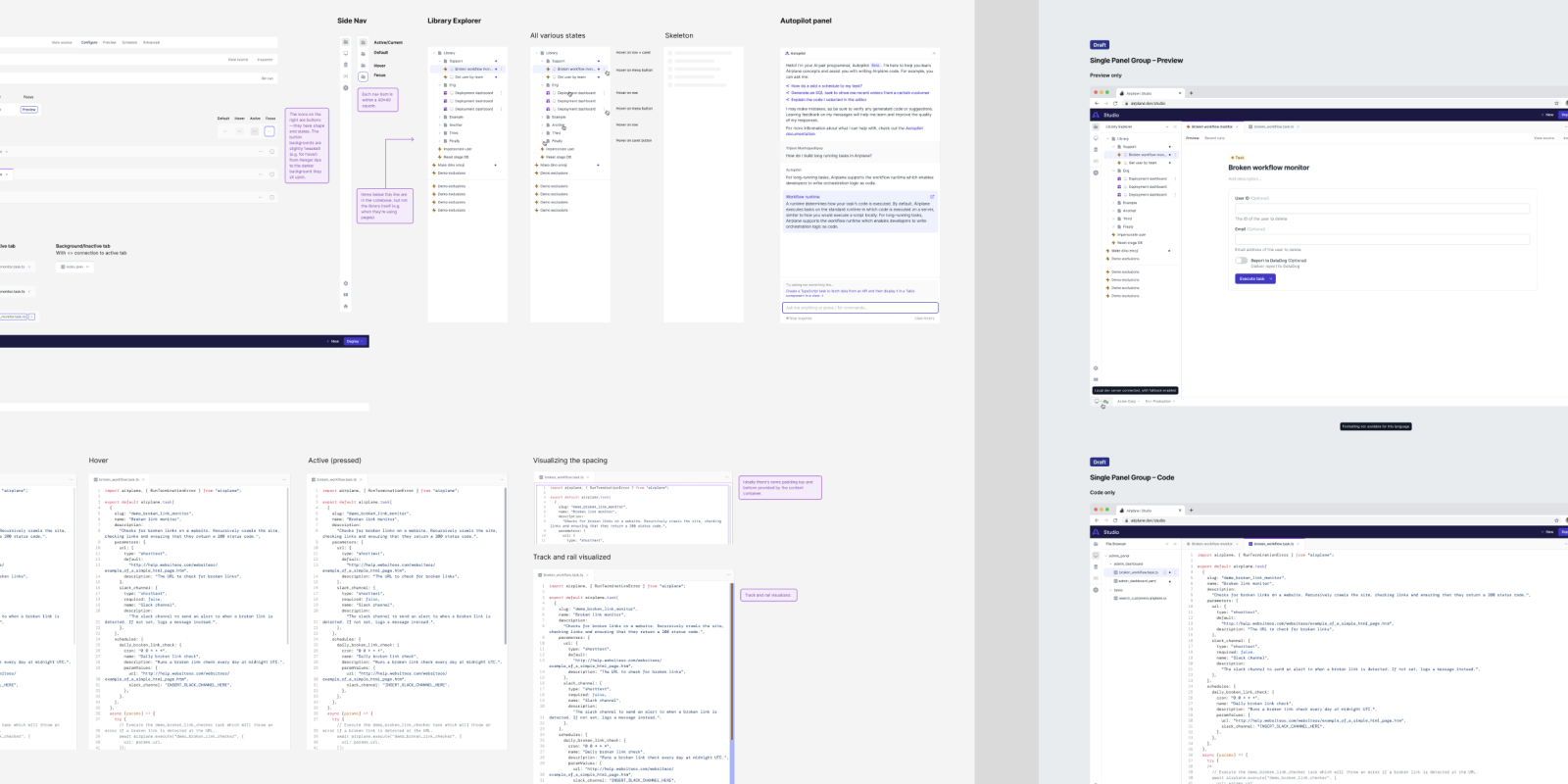
I decided to do a lightweight design exploration to get a sense of where we might have quick wins to refine the Studio product’s information architecture and overall design language. This was an interesting project, because it wasn’t strictly on the roadmap, and I wasn’t even on the Studio product team—another designer was working on that team, focused on executing on the cloud-based creation and editing shift. However, Airplane’s design team had created a very strong, high-trust, and low-ego collaborative environment, which meant that we were able to discuss and explore this thinking almost right from the beginning.
With the other designer’s encouragement and with collaboration with the Studio engineering team, I defined a tight timebox to take some of this thinking further.
With a few specific constraints in mind, I explored and proposed a systematic refresh of the Studio information architecture and design language. Together with the engineers, we explored how it might be staged in implementation so that it would be an immediate improvement, and unlock future project features and surfaces.

Projects like these can be difficult to get done: they’re a bigger lift that cross a broad product surface area, which makes it challenging to address as part of any one focused project area without spinning off into scope creep. But, if it’s not done, then design, usability, and tech debt invariably build up, leading to more and more hacks and workarounds that get even harder to solve over time.
In this case, I was able to set out clear boundaries and constraints based on the intended goals: improved, future-looking information architecture and navigation, and unified and systematic visual design and UI patterns. We would avoid “new” features or functionality, but we would be aware of how the underlying patterns would support future new features and functionality.
Based on the proposal, the Studio team and engineering leadership had a serious appetite to execute. We had an upcoming all-hands offsite with some hacking planned: the Studio team proposed that they spend the week in heads-down, tactical execution mode co-located together with the rest of the team and the designers. In just 3-4 days, the team executed and shipped the refresh.
We heard immediate positive feedback from both customers who loved the jump in developer experience and internal stakeholders like sales team members about how the improvements made sales calls and demos more effective.
And it paid dividends down the line: the original trigger for the effort was in looking ahead and seeing the pain we’d face in delivering a Studio-based configuration path for Pages. When we reached this point of our roadmap for Pages, we were able to design a solution for this almost effortlessly, because the underlying information architecture and patterns in Studio just worked.