Reimagining Airplane’s task run experience
Organization
Airplane
Role
Staff Product Designer
Date
2023
Airplane is the developer platform for internal tools. I joined Airplane at the beginning of 2023 as the company’s second designer, shortly after their Series B, working to define the future of internal tooling with a focus on developer-centric concepts and workflows.
Airplane’s roughly 20-person team had built out a broad product solving a range of problems relating to building, deploying, and using internal tools. There were two primary archetypes using Airplane: builders and operators. Builders would build tools, and operators would use tools.
Tasks are the core building block for creating internal tools in Airplane. Builders can define inputs, workflows, and logic streams in config or code, test and iterate locally using Airplane Studio, then deploy to the Airplane platform for their team to use with full security, logging, and observability.
Tasks are super powerful. Developers can define things like parameters, build complex logic chains, fire off side effects like calling external APIs and handling responses, interact with connected resources like external databases, and even do things like trigger other Tasks as children. Operators can then log in to Airplane, navigate to Tasks in the team library, and do things like execute tasks, monitor task runs, review previous runs, schedule tasks to excute in the future, and more.
While powerful, tasks evolved in an additive, feature-by-feature way where the team layered these new features on top of the original UI and model of tasks and task runs.
The initial underlying pattern was fundamentally single input/output—“give input, push button, get output.” This pattern applied to a task that executes SQL is basically, “Open Task, press execute, see table with resulting output of that SQL.”
But at the time we started thinking about the task run experience more deeply, the underlying pattern was beginning to look a lot more like a pipeline or workflow orchestration, not just single input/output. In a space where workflows, prompts, displays, retries, branches, and errors all contribute to task orchestration, the original pattern of “give input, push button, get output” wasn’t creating a great experience for users.
We were hearing feedback both from customers and internally about the state of tasks: they felt inconsistent, it was hard to understand what was happening and how to troubleshoot when things went wrong, and things like how system state and progress were communicated made tasks feel slow and unresponsive.
We knew that strategically we wanted to address this, but what exactly that meant was ambiguous and open-ended. I owned exploring and shaping this problem area, proposing a project effort and driving alignment and buy-in, and end-to-end design—from early explorations to high-fidelity execution and even contributing in code.
The team here involved myself as the design lead and de facto product manager (Airplane didn’t have dedicated product managers, and instead, design and engineering leads acted as product leaders). I collaborated with the team working on tasks, particularly the engineering lead and a developer who had worked on tasks from the beginning.
I heard an appetite from the leadership team to improve the overall working process at Airplane. When I joined, the team had just finished building out a separate product called Views over the course of about 6-8 months. This ended up being an extensive, complex buildout. As a company, we wanted to get scrappier and more pragmatic, so that we could ship real value faster, and course-correct sooner.
I used this project to improve our approach to shaping and building cycles. In shaping, we explore and refine the problem and the shape of the solution with clear iterative goals in mind, and then in building we tackle both high-fidelity design and implementation in parallel where possible.
I used a PRD as the source of truth for our remote and distributed team while working through the shaping process.
Through a mix of user feedback, first-principles thinking, and usability heuristics, I aligned the team on the problems in a concrete way. For example:
- The task run timeline wasn’t effective at surfacing what’s happening while a task is running, which make task orchestration hard to understand and reason about.
- The transition from “viewing a task” to “a task run” created a disconnected context shift, which reduced usability for new users and made it harder to effectively handle things like auto-running tasks.
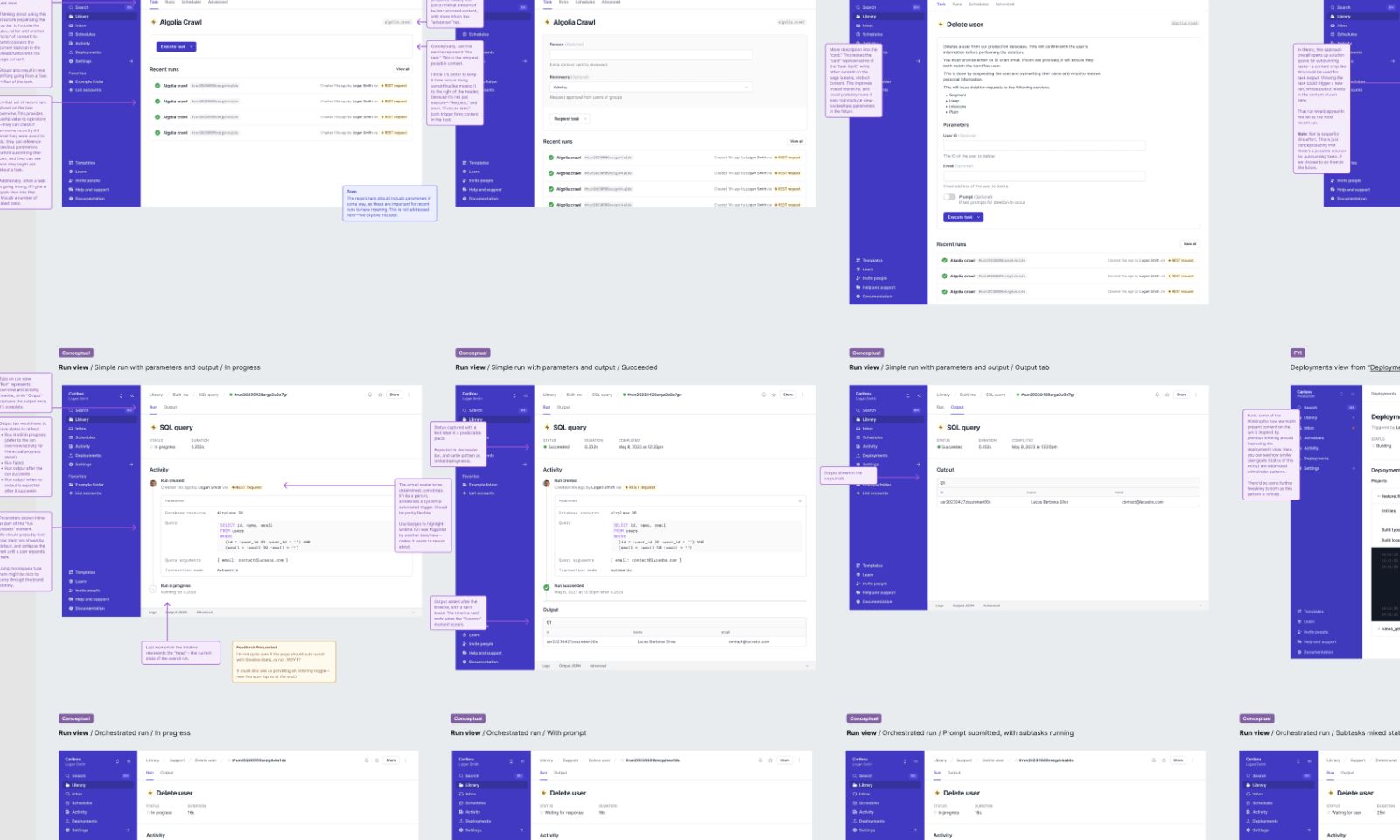
While driving the shaping process through to approval and getting the project on the roadmap, I spent time exploring different approaches we might take in design at a breadboard-level of fidelity. A couple of things we explored and decided relatively early included:
Tasks and task runs as separate but hierarchical concepts. We had some early thinking around whether tasks and task runs should be in some way merged into a single entity in the UI. In theory, this could make “autorunning tasks” feasible. While an interesting exploration, this went to show that the underlying information architecture we already had was sound, and it was more in the way that the task and task run views were presented that was problematic.
Task run timeline and “moments.” There were quite a few ways we could surface a task’s run in progress. It quickly became clear there was no strictly “correct” way of doing it. Ultimately, I had to develop a strong opinion that balanced both user archetypes and short-and-long-term priorities for the platform.
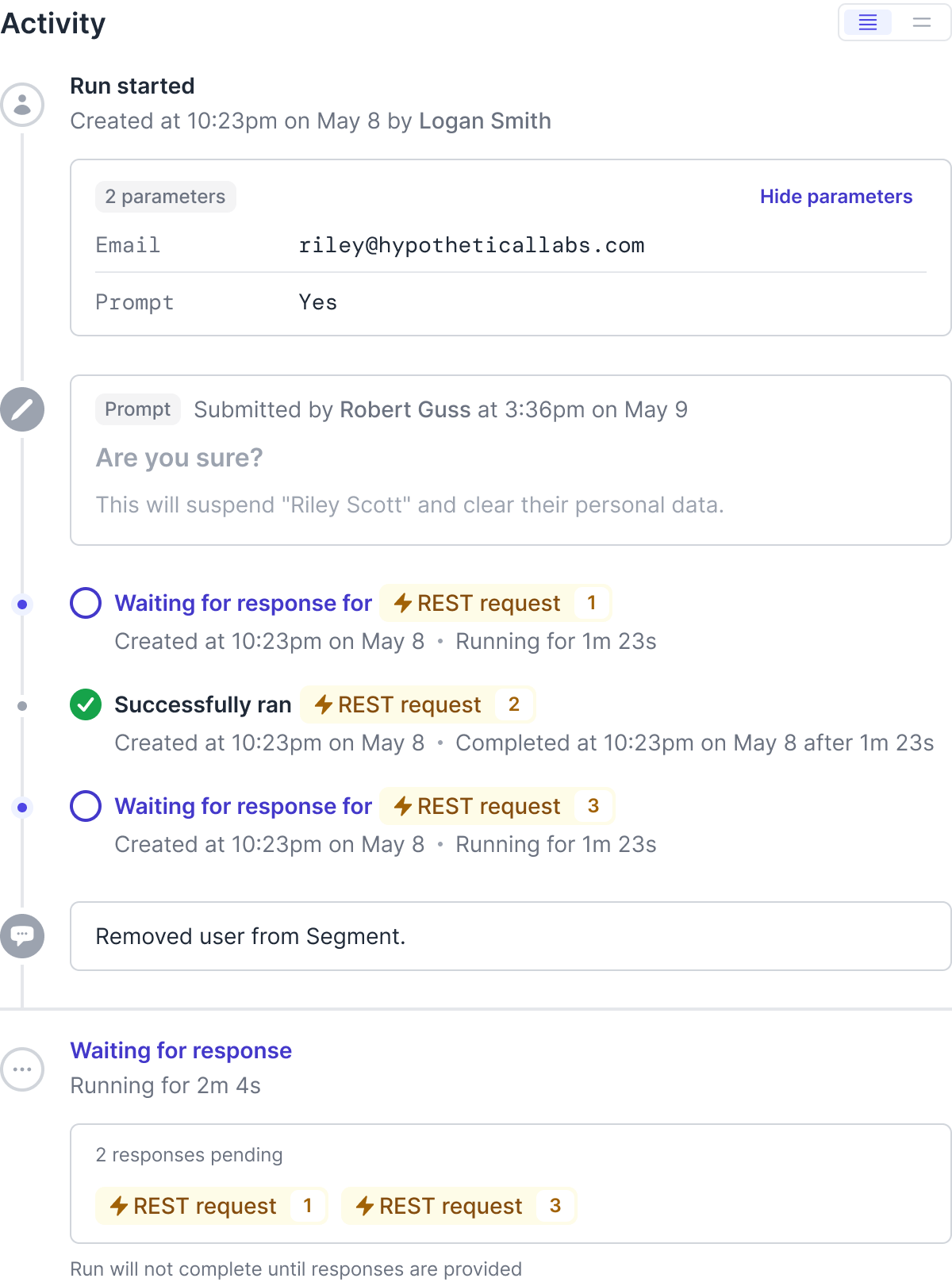
We ended up with a conceptual model of a task run as having a “timeline” and introduced an entity called a “moment” for individual timeline items.
The “timeline” would reflect a series of somewhat-stateful moments. A shortcut for this conceptually was “…the tense of a moment reflects its state. If it's ‘final’ then it's past tense. If it's ‘current’ then it's present tense.” A given task run’s overall status would reflect a logical outcome of the various moments in the timeline, which themselves would bubble up their state to their parent run, if any.
This system worked quite well for a variety of complex orchestration scenarios and edge cases.
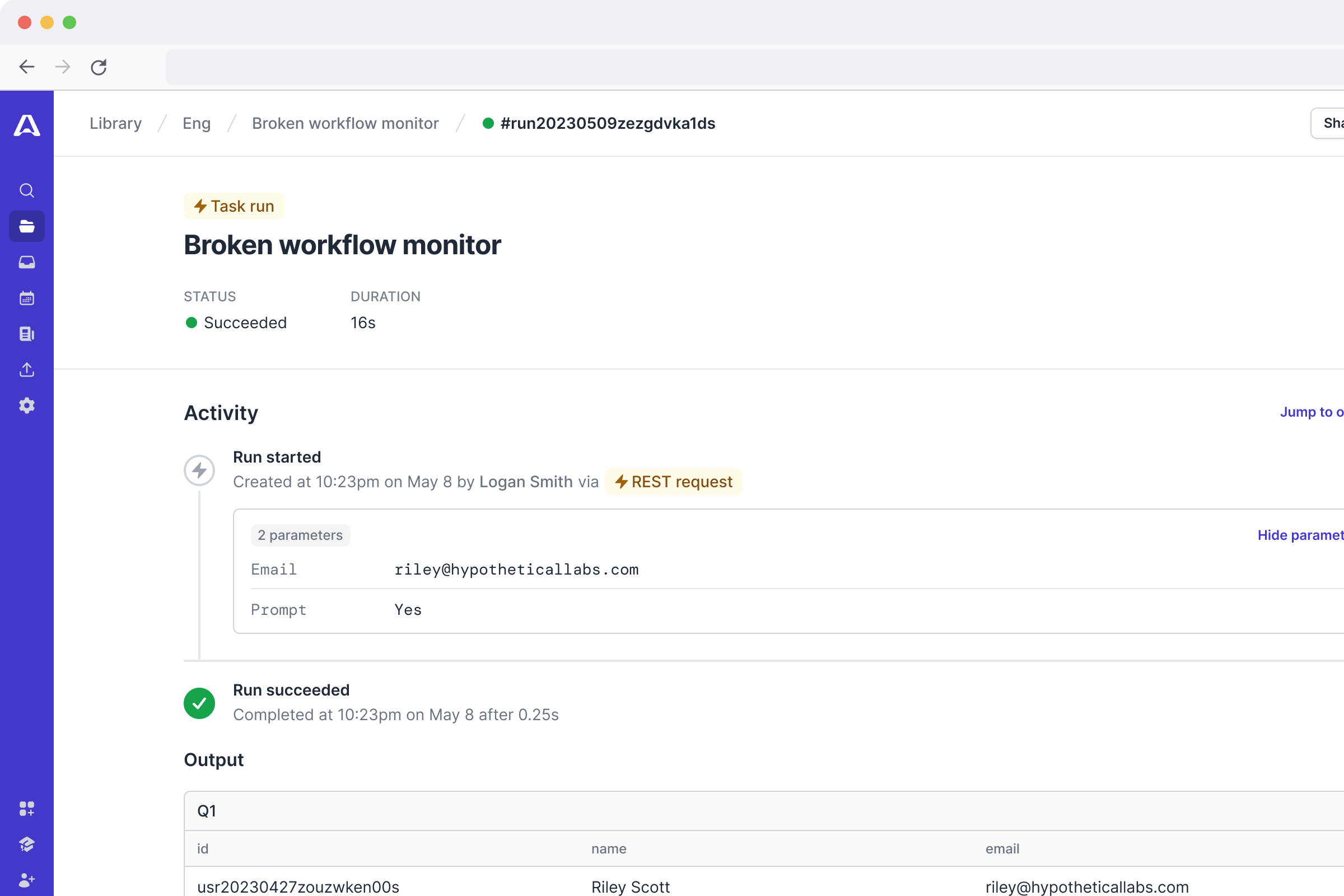
In the redesigned Task run interface, system status is made transparent and traceable. The concept of stateful semi-linear moments on the task run timeline help users understand what is happening when.
The new task run UI can handle complex workflows, including sub-task execution, approval flows, and long-running tasks.
Once we agreed as a leadership group to move forward with this project, we worked as a small project team to refine design and begin implementation at the same time. We very quickly reached the first shippable milestone, which we began testing internally.
Tricky tradeoffs along the way. One tradeoff was de-scoping the concept of an “await group” within the timeline. We had a model of surfacing child task runs that would appear as fixed, stateful moments in the timeline. But from a first principles perspective, sometimes users don’t need to know the state of each individual child run separately, but rather the state of a group of child runs.
Technically, this represented rippling complexity: we’d have to introduce a first-class concept of a “group of things” in the Airplane SDK itself, for all the ways that tasks can be defined in code or in UI. We needed to ship and feel out the underlying system before we started building new things on top of it.
Proving ground for Airplane’s design system. At the same time I was working on this project I was also leading a design effort to establish Airplane’s design system. This project became an opportunity to begin implementing the system in production in a slightly fractal way.
After refinements in response to internal feedback, we shipped this to our customers.
As an early stage startup, we didn’t have much in the way of tooling or statistical relevance for quantitative feedback. We relied heavily on first principles thinking and directly working with customers to learn how they responded and used our ideas, which helped us stay lean and scrappy.
Those customers that actively noticed the changes, were very happy about them. Funny enough, many other customers didn’t actively notice the changes at all—they simply used Airplane’s tasks, succesfully. I consider this to be a super positive outcome in terms of evolving an existing core workflow UI, which can be disruptive.
We also often heard support requests and feedback in external customer Slack channels or in customer calls like “this task seems stuck,” typically the result of poor visibility into the system state. After shipping this project, this kind of support feedback just vanished.